Android's Next-Generation Design Language

Table of Contents
Material Design 3: The Foundation of Modern Android Design
Material Design 3 forms the bedrock of the modern Android design language. It builds upon previous iterations, refining and enhancing core principles to create a more adaptable and visually stunning experience. This section will explore key improvements within Material Design 3.
Enhanced Color System
Material Design 3 introduces a significantly enhanced color system, offering greater flexibility and personalization options. Gone are the rigid color palettes of the past; now, developers can leverage a more dynamic and adaptive approach.
- Seed colors: Starting with a single "seed" color, the system generates a range of related shades and tints, ensuring harmonious color schemes across the entire application.
- Tonal elevation: Colors adapt based on their position within the UI hierarchy, creating depth and visual clarity. This subtly alters the saturation and lightness of colors, providing visual cues for users.
- Improved contrast ratios: Material Design 3 prioritizes accessibility, ensuring sufficient contrast between text and background colors, improving readability for all users.
- Accessibility benefits: The expanded color palette and improved contrast ratios directly enhance the accessibility of Android applications, making them usable for a wider range of individuals.
Developers can implement these features using the updated MaterialTheme and color resources within their Android projects. The benefits include a more consistent and visually appealing brand identity, improved user comprehension, and greater accessibility.
Updated Typography and Shape System
Material Design 3 refines the typography and shape systems to create a more consistent and visually pleasing UI. This leads to improved readability and a more unified aesthetic across different Android apps.
- Improved readability: The updated typography system utilizes improved font choices and scaling, optimizing readability across various screen sizes and resolutions. This includes better support for different languages and scripts.
- Consistent button shapes: Material Design 3 promotes the use of consistent button shapes and sizes for a unified experience. This improves predictability and usability.
- Dynamic corners: The new shape system allows for dynamic corner radii, enabling developers to create more visually interesting and modern UI elements.
- Updated icons: The iconography has been updated to better align with the overall aesthetic of Material Design 3, offering a more modern and consistent look.
These refinements contribute to a cleaner, more professional, and ultimately more user-friendly visual hierarchy within Android applications.
Improved Motion and Animation
Subtle yet effective animations and transitions are crucial for creating a fluid and engaging user experience. Material Design 3 elevates the importance of motion design.
- Improved responsiveness: Animations provide visual feedback, making interactions feel more responsive and natural.
- Smooth transitions: Seamless transitions between screens and UI elements create a more polished and professional feel.
- Intuitive feedback: Animations can provide clear visual feedback to user actions, improving the understanding of app functionality.
Developers can utilize Android's animation frameworks and libraries to implement these effects. Well-crafted animations enhance the perceived performance of the app, making it feel faster and more responsive.
Focus on Accessibility and Inclusivity
Android's next-generation design language places a strong emphasis on accessibility and inclusivity, ensuring that apps are usable by everyone.
Enhanced Accessibility Features
Material Design 3 integrates several features to improve usability for users with disabilities:
- Improved screen reader compatibility: Enhanced semantic structure and labeling make apps more accessible to screen reader users.
- Larger touch targets: Larger interactive elements make it easier for users with motor impairments to interact with the app.
- Customizable text sizes: Users can adjust the text size to improve readability according to their individual needs.
- High contrast modes: Users can enable high contrast modes for better visibility.
These features are crucial for promoting inclusivity and ensuring that Android apps are usable by a broad audience.
Guidelines for Inclusive Design
Designing for inclusivity goes beyond simply implementing accessibility features. It requires a holistic approach:
- Consideration for cognitive differences: Design elements should be easy to understand and use for users with cognitive impairments.
- Diverse visual needs: Consider users with various visual impairments, such as color blindness.
- Multilingual support: Support for multiple languages is crucial for reaching a global audience.
By adhering to these guidelines, developers can create apps that are truly inclusive and cater to the diverse needs of their users.
Tools and Resources for Developers
Implementing the next-generation Android design language is simplified by a wealth of resources available to developers.
Android Developer Documentation
The official Android developer documentation is the definitive source for information on Material Design 3:
- Links to official Android developer documentation: (replace with actual relevant links)
- Design guidelines: Detailed guidelines and best practices are readily available.
- Code samples: Numerous code samples demonstrate how to implement different aspects of Material Design 3.
Staying updated with the latest documentation is crucial for ensuring that your apps adhere to the latest standards.
Design Tools and Libraries
Several tools and libraries streamline the implementation process:
- Jetpack Compose: Google's modern toolkit for building Android UIs simplifies the implementation of Material Design 3 components.
- Figma plugins: Various Figma plugins can help design and prototype apps adhering to Material Design 3 guidelines.
- Other helpful resources: Numerous third-party libraries and tools offer additional support.
These tools significantly reduce development time and ensure consistency with the new design language.
Conclusion
Android's next-generation design language represents a significant advancement in mobile UX. By embracing Material Design 3 and its focus on accessibility, inclusivity, and visual appeal, developers can create exceptional Android applications. Staying updated with the latest guidelines and leveraging the available tools are key to building apps that meet the highest standards of design and usability. Learn more and start building the future of Android apps with the latest Android design language today!
Featured Posts
-
 Androids Design Language Overhaul Key Features
May 16, 2025
Androids Design Language Overhaul Key Features
May 16, 2025 -
 Paddy Pimblett Vs Michael Chandler A Ufc Veterans Perspective On The Odd Pairing
May 16, 2025
Paddy Pimblett Vs Michael Chandler A Ufc Veterans Perspective On The Odd Pairing
May 16, 2025 -
 Portugal Vence A Belgica 1 0 Resumen Del Partido Y Goles
May 16, 2025
Portugal Vence A Belgica 1 0 Resumen Del Partido Y Goles
May 16, 2025 -
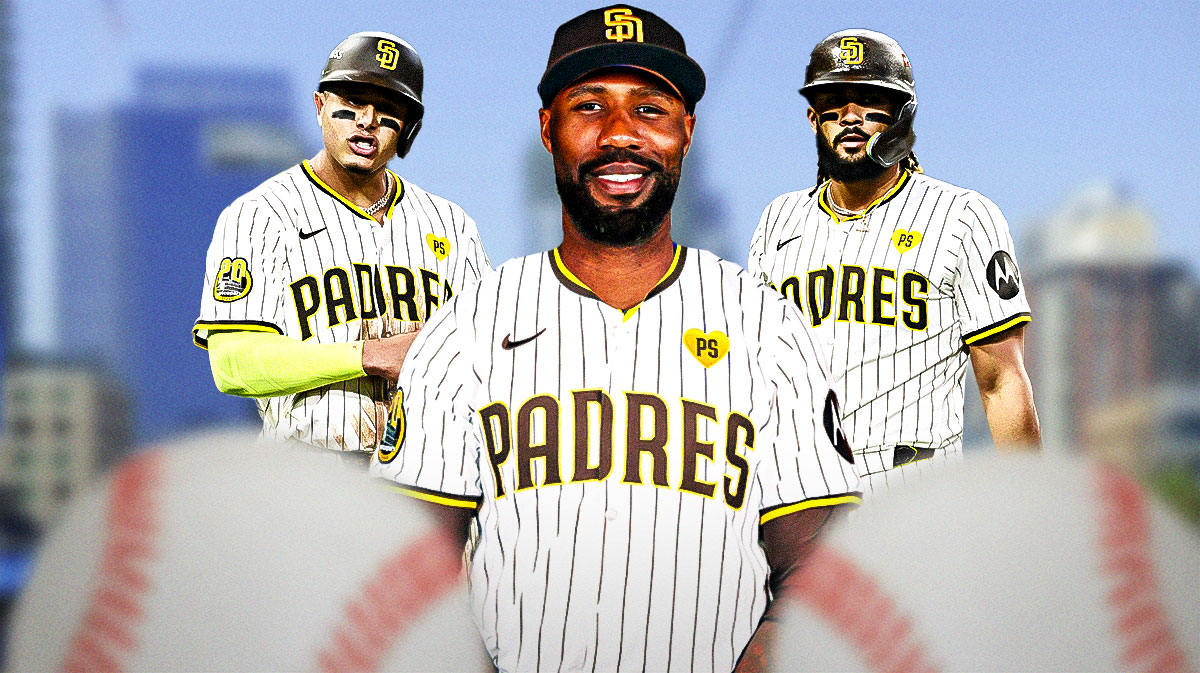 Luis Arraez And Jason Heyward Power Padres Sweep Attempt Pregame Analysis
May 16, 2025
Luis Arraez And Jason Heyward Power Padres Sweep Attempt Pregame Analysis
May 16, 2025 -
 The Human Cost Of Military Discharge A Transgender Soldiers Story
May 16, 2025
The Human Cost Of Military Discharge A Transgender Soldiers Story
May 16, 2025
Latest Posts
-
 Muncy Breaks Drought First Home Run Of 2025
May 16, 2025
Muncy Breaks Drought First Home Run Of 2025
May 16, 2025 -
 The Muncy Paradox Imagining A Conversation Between Two Max Muncys
May 16, 2025
The Muncy Paradox Imagining A Conversation Between Two Max Muncys
May 16, 2025 -
 Parallel Universes A Hypothetical Conversation Between Two Max Muncys
May 16, 2025
Parallel Universes A Hypothetical Conversation Between Two Max Muncys
May 16, 2025 -
 Dodgers Kims Explosive Performance Secures Doubleheader Sweep In Oklahoma City
May 16, 2025
Dodgers Kims Explosive Performance Secures Doubleheader Sweep In Oklahoma City
May 16, 2025 -
 Oklahoma City Doubleheader Dodgers Kim Delivers With Homer Two Steals
May 16, 2025
Oklahoma City Doubleheader Dodgers Kim Delivers With Homer Two Steals
May 16, 2025

